A product concept of an AI-Driven “Task Optimizer” for working mothers.
tasknet
Case Study - DesignLab Project
background
In 2023, 74% of mothers with children under 18 were in the labor force, which is up from the previous year. A significant number of women are balancing work and family responsibilities.
By: Bureau of Labor Statistics 2023
Published: April 24, 2024
problem to solve
With a full load of work tasks, children’s schedules, and household responsibilities, they frequently struggle to manage time effectively, often feeling overwhelmed.
Due to all these responsibilities, personal time is usually the first thing sacrificed, meaning self-care and mental wellness take a backseat. This lack of time can easily lead to burnout, as there are few opportunities to recharge.
project details
Project Type: End-to-end iOS app + branding.
Role: Sole UX/UI designer
Tools: Figma, FigJam, Zoom, Photoshop
Methods: User Research, Usability Testing, Information Architecture, UI Design, Visual Design, Brand Design
Duration: 100 hours
the user
Focusing on iPhone users. Working mother with a spouse/partner and 2 older kids that have their own phones.
quick sneak peek

Homepage
- The app allows users to sync their own and their family's current calendars, tasks, and reminders and to select personal goals.
-
Users can set priority for each event, task, and reminder in the app. Different priority items get different visual hierarchies.
-
The home page will list today's high and medium-priority items for the user and their family members, along with the personal goals they have set for themselves.
Calendar & To-Dos
-
Users can view, filter, search, add and assign events/todos for family members and themselves.


Personal Goals
-
Users can track personal goals.
-
Daily stats give users an insight into their progress and encourage them to earn badges and personalized messages.
the process
Discovery & Research
Research Objective:
-
Learn about their day-to-day activities.
-
Learn about the factors that impact their changing priorities and undone tasks.
-
Learn about the tools, resources, or strategies they use to manage their busy schedule.
-
Learn about their personal time and what they'd like to do during that time.
What I Already Knew Through Secondary Research:
-
Currently, working mothers use Cozi or OurHome for family tasks, Trello for personal and work project management, Headspace for self-care, and Mealime for meal planning. However, a unified solution that integrates smart scheduling, self-care, family task delegation, and personalized reminders doesn’t yet exist as a single app specifically tailored to working mothers.
Competitive Analysis:
Researching the main competitors helped me understand how the problems were currently being solved on the market and which problems still needed to be solved.

User Interviews:
Once I understood the problems with prioritizing day-to-day tasks through competitive analysis, I selected five users to interview.
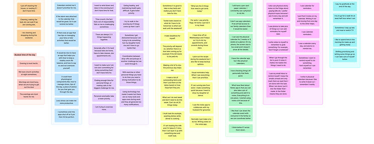
Pulling Out The Key Themes:
Affinity mapping helped to organize the data from user interviews into actionable insights.
.jpg)
Calendars remind me it doesn’t prioritize for me.
there are so many tools and apps even during work and they all generate too many notifications.
Finding enough time for personal things is the biggest challenge
for me.
It would be nice to have an app that helps you with How to keep a healthy work-life balance.
When I go through the list in post-it notes it makes me realize the things I need to do.
Here are some of the biggest learnings from affinity mapping:
-
Users liked using calendars, notes, and reminders to keep up with their schedules.
-
Users preferred prioritizing and having personal time.
-
Users struggled with multi-tasking and juggling between work and home.
-
Users think they don’t have enough time to care for themselves.
-
Users think personal care takes lower priority.
Creating Personas:
After I compiled the findings from the research through the affinity map, I was able to create personas that represent my target demographic.


Finding Project Direction :
I brainstormed several POVs and HMVs and narrowed them down to the ones below:
POV
-
I’d like to explore ways to make it easier for users (busy mothers) to manage their schedules and streamline prioritizations.
-
I’d like to explore ways to allow users to manage their schedules, family, and friends.
-
I’d like to explore ways to help users find personal time
HMV Statements:
-
How might we provide recommendations and reminders, helping users prioritize their important tasks to reduce stress and overload?
-
How might we educate users to emphasize wellness?
-
How might we provide a tool that seamlessly integrates with popular apps, calendars (e.g., Google Calendar, Reminders, Notes), and productivity tools to minimize the need to switch between apps?
-
How might we provide a personalized experience and learn from each user’s unique habits, preferences, goals, and needs?
Define & Ideate
Generating Ideas:
From the HMV statements above and came up with the following ideas:
Syncing with current productivity tools and creating shared tasks.
-
Syncs kids’ school events, doctor’s appointments, meal planning, and a partner’s schedule into one streamlined view.
-
Assigning tasks to family members to lighten the load.
-
Recognizes repeat tasks and suggests ways to delegate.
Provide a personalized experience and learn from each user’s unique habits, preferences, goals, and needs.
-
Helps prioritize tasks by suggesting the top 3 most important things to focus on daily.
-
Breaks down overwhelming tasks into bite-sized, 10-minute actions based on available time.
-
Moms can list their to-dos, and AI categorizes them into urgent, important, or can wait.
-
A digital version of a household whiteboard, syncing tasks, groceries, schedules, and reminders in one place.
-
Learns from routine, auto-schedules tasks, suggests the best times for self-care, and syncs with family calendars.
-
Provides a personalized summary of the day ahead, including reminders and important events.
-
Recommends micro-habits based on personal goals (e.g., water intake, stretching, mindfulness) and adjusts based on progress.
-
Analyzes past routines to suggest ways to streamline busy time/schedule.
-
Identifies small pockets of free time and suggests personalized self-care activities.
-
Learns nighttime habits and recommends tweaks for better rest, like ideal bedtime or wind-down routines.
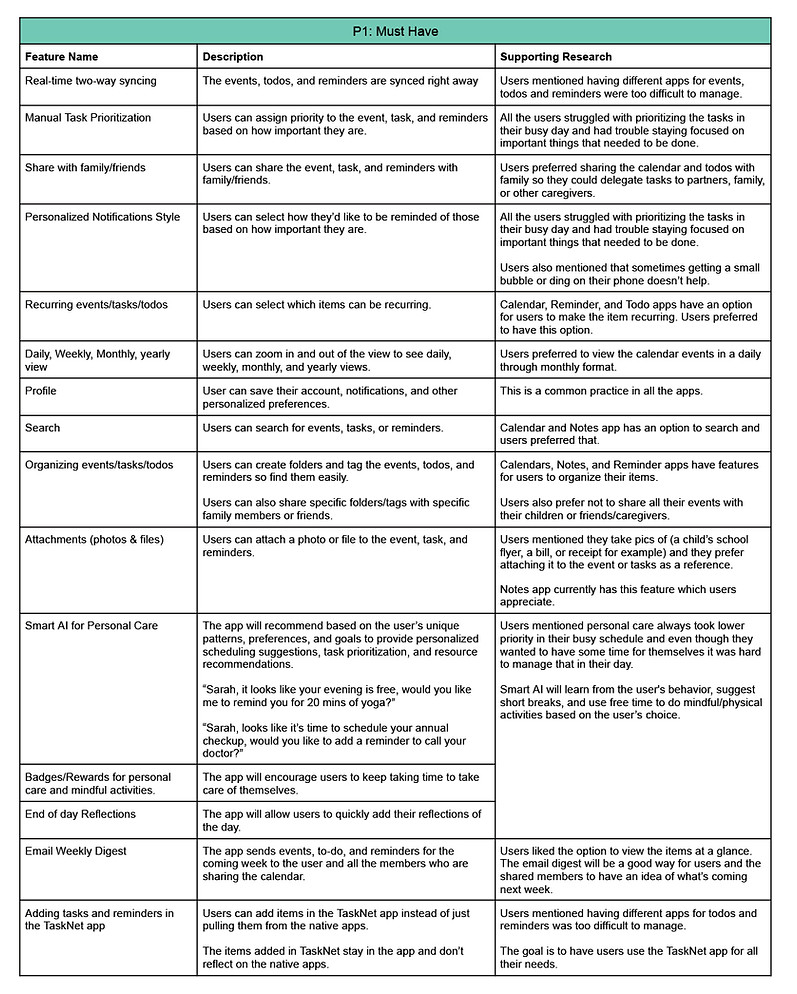
Prioritizing Design Decisions:
Based on these ideas and the information gathered from user interviews, I prioritized features:


Design, Prototype & Test
Sketching Out The Possibilities:
I sketched multiple different variations and shared those options with 5 users for feedback.

4/5 users preferred the option where all the events and to-dos were listed together and had the tabs for me vs. family instead of hiding them under the filter.
They also liked the idea of the homepage showing all the high- and medium-priority events and to-dos that need to be done today together. According to the users, "It's all the things that need to be taken care of today."


4/5 of users understood the daily view of the calendar but didn't think weekly or monthly calendar view was helpful with just the lines.
Mid-Fidelity Wireframes:
I incorporated the user feedback and did mid-fi wireframes.
5/5 users liked the personalized AI suggestion on the top.
4/5 users asked how can they edit the events and to-dos.

5/5 users understood the Family tab but also asked if they will see their events and tasks here as well.
They wondered why the events and to-dos had different color background


4/5 of users understood the daily view of the calendar but still weren't sure how to read the different color coded lines.


-
3/5 users wondered if the ToDos can be added as an event so it shows up as blocked time and other people know you’re not available during that time.
-
4/5 users asked if they can see Jake's all To-Dos together.


-
3/5 users thought it would be nice if it give them a summary for their goals as they finish them like some of the fitness apps do.
As I continued, I realized that some additional screens and UI changes were required to fully address the necessary task flows for user testing in the high-fidelity prototype.
UI Kit:
Before moving on to my high-fidelity designs, I created a UI kit that reflects the TaskNet brand objectives.

-
Opted for shades of red with different treatments to highlight the urgency of the events and to-dos.
-
The green highlights completed items.
-
The rest of the UI uses black, gray, and white colors for a simplistic and clean look.
-
I chose Reddit Sans as the main font for all the content as it offers better readability.
Empowerment
Balance
Support
Growth Wellness
Simplicity


-
The homepage lists all high to medium-priority events and to-dos identified by the user. They will be listed in chronological order.
-
The order of the list will be:
-
High priority
-
Medium priority
-
Done to-dos
-
-
The high-priority items will show the time/deadline for when it needs to be done.
-
The family tab lists all high to medium-priority events and to-dos identified by the respective family members.
Creating a Polished Prototype:
Based on the chosen brand value and color palate I designed high-fi wireframes.


-
The events are highlighted based on the priority level along with the time/deadline.
-
The To-dos added to the calendar by the user will be listed with the to-do icon
-
Users can filter the view by Today, Weekly, and Monthly.
-
Monthly view lists the events & to-dos highlighting the priority as well as the ones that are done.
-
Users can add new events as well as search for a specific event.
-
While adding or editing an event, users can assign it to themselves or a family member, assign a priority level, add a to-do list, and attach an image.
-
There will be different tabs for each family member.


-
All high to medium-priority to-dos as identified by the user will be listed in chronological order.
-
Users can mark the to-do as done by tapping the checkbox. They will appear green.
-
Users can filter the view by Today, Weekly, and Monthly.
-
Users can add new to-dos as well as search for a specific to-do.
-
While adding or editing a to-do, users can assign it to themselves or a family member, assign a priority level, add it to the calendar, and add sub-tasks.
-
There will be different tabs for each family member.


-
All the goals set by the user are listed with not done on top.
-
Users can mark the goals as done by tapping the checkbox. They will appear green.
-
Users can filter the view by Today, Weekly, and Monthly.
-
Users can add new goals.
-
A personalized message is displayed based on whether the user is on track or needs to work on their goals.
Usability Testing With The Prototype:
I tested the mockups with 5 users remotely via the screen share feature. The usability test was moderated and took about 30-45 minutes per user to complete.
Key Research Goals:
-
If users find the AI recommendation helpful.
-
If users notice the “Personal” and “Family” tabs and know what they are for.
-
If users find the difference between Events and To-Dos on the homepage.
-
If users notice different treatments for each item.
-
If users understand how the calendar works (weekly, daily, monthly view) and find the filter options useful.
-
If users find the Tasks and Lists combined as To-Dos easy to understand and manage.
-
If users find the goals section helpful.
Measuring Success:
I evaluated the overall success of the product and any iterations needed with the following metrics gathered from my testing:
-
Users liked the idea of having all the options items in a single app to plan their day better.
-
Users were able to navigate to different sections of the page and thought the design was clean.
-
Users were not sure what certain items were highlighted, but after looking at the content they guessed that highlighted items might be important.
-
Users didn’t understand the filter icon but once they knew, they used it on other pages.
-
Users didn’t know why certain items had two pics on the family tab but after inquiring further, they guessed maybe it was shared between two people.
-
Users asked how can they add new events or to-dos from the homepage.
-
Uses didn't know how would they be able to identify which event-todo was for which family member from the homepage.
-
Users thought the monthly view of the calendar wasn't very helpful because they could not see what each item was.
-
Users were confused how are they able to check the to-dos of their family members.
Final Design Iterations
Homepage:
BEFORE

AFTER


-
Added a little icon for each tile based on whether it's an event or a to-do.
-
Added profile photos instead of generic icons.
-
Added an option to add an event or to-do as well as search for them.
Monthly Calendar:
BEFORE

AFTER

-
Added more details on the monthly view based on the feedback.
To-Dos:
BEFORE

AFTER

-
Moved the checkbox on the left side to be consistent.

-
Made checkboxes disabled for the family members. User will only be able to mark their tasks as "done".
What I learned:
While working on this project I learned…
-
Addressing all use cases in mid-fi is crucial for gathering feedback on key functionalities.
-
When users can easily recognize and correct their mistakes, they learn from them and become more skilled with the system over time.
-
Identify the pain points that cause users to dislike something. By understanding the underlying reasons, you can pinpoint the real issue and take the necessary steps to resolve it.